


Basics of Flexbox
Flexbox is a whole module and not a single property. Some of the properties are meant to be set on the container (parent element), known as “flex container” whereas the others are meant to be set on the children known as “flex items”.
Flex layout is based on flex-flow directions. Have a look on the figure.
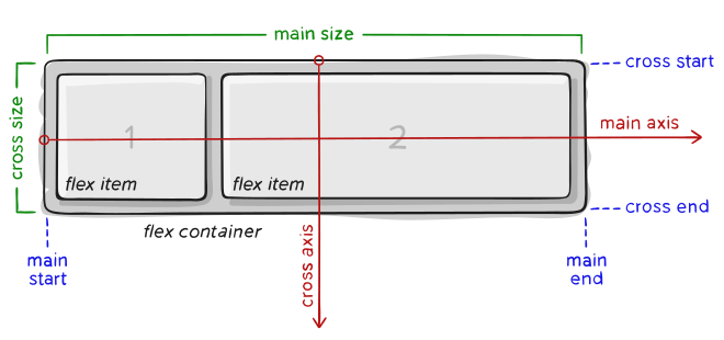 Items will be laid out either on the main axis or cross axis.
main axis – The main axis of a flex container is the primary axis along which flex items are laid out. It is not necessarily horizontal; it depends on the flex-direction property.
main-start | main-end – The flex items are placed within the container starting from main-start and going to main-end.
main size – A flex item’s width or height, whichever is in the main dimension, is the item’s main size.
cross axis – The axis perpendicular to the main axis is called the cross axis. Its direction depends on the main axis direction.
cross-start | cross-end – Flex lines are filled with items and placed into the container starting on the cross-start side of the flex container and going toward the cross-end side.
cross size – The width or height of a flex item, whichever is in the cross dimension, is the item’s cross size. The cross size property is whichever of ‘width’ or ‘height’ that is in the cross dimension.
FLEXBOX PROPERTIES
Properties for the Flex-Container :
- display : This defines a flex container; inline or block depending upon the value.
.container{
        display: flex;
        background-color: #E0D7FF;
        width:500px;
        height: 300px;
    }
Output: Below image shows a container with 3 items.
- flex-direction : Flexbox is a single-direction layout concept. flex-direction have four additional properties :
- row (default)
- row-reverse
- column
- column-reverse
 .container{
        display: flex;
        background-color: #E0D7FF;
        width:500px;
        height: 300px;
        flex-direction: row-reverse;
    }
Output :
- flex-wrap : We can allow the items to wrap as needed with this property.
.container {
  flex-wrap: nowrap | wrap | wrap-reverse;
}
- nowrap (default)
- wrap
- wrap-reverse
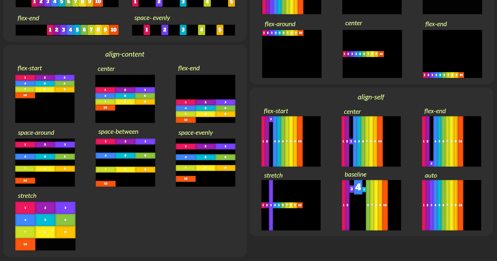
- justify-content : This defines the alignment along the main axis. It helps distribute extra free space leftover.
.container {
  justify-content:  center;
}
Output :
.container {
  justify-content:  space-around;
}
Output :
- flex-start (default)
- flex-end
- start
- end
- left
- right
- center
- space-between
- space-around
- space-evenly
- align-items : This defines the default behavior for how flex items are laid out along the cross axis (perpendicular to the main axis) on the current line.
.container{
        display: flex;
        background-color: #E0D7FF;
        width:500px;
        height: 300px;
        align-items: center;
    }
Output :
- stretch (default)
- flex-start / start / self-start
- flex-end / end / self-end
- center
- baseline
- align-content : This aligns a flex container’s lines within when there is extra space in the cross-axis. Note : This property only takes effect on multi-line flexible containers.
.container {
  align-content: flex-start | flex-end | center | space-between | space-around | space-evenly | stretch | start | end | baseline | first baseline | last baseline;
}
- gap, row-gap, column-gap : The gap property controls the space between flex items. It applies that spacing only between items.
.container{
        display: flex;
        background-color: #E0D7FF;
        width:500px;
        height: 300px;
        align-items: center;
        justify-content: center;
        gap:53px;
    }
Output :
- gap: 10px;
- gap: 10px 20px; / row-gap column gap /
- row-gap: 10px;
- column-gap: 20px;
Properties for the flex-items :
- order : The order property controls the order in which they appear in the flex container.
.container{
        display: flex;
        background-color: #CCF1FF;
        width:500px;
        height: 300px;
        align-items: center;
        justify-content: center;
        gap:53px;
    }
    .item1{
        order:3;
    }
Output :
- flex-grow : This defines the ability for a flex item to grow. It accepts a unitless. It dictates what amount of the available space inside the flex container the item should take up. default value is 0
.container{
        display: flex;
        background-color: #CCF1FF;
        width:500px;
        height: 300px;
        align-items: center;
        justify-content: center;
        gap:53px;
    }
    .item1{
        flex-grow: 2; /*default : 0*/
    }
    .item2{
        flex-grow: 0;
    }
    .item3{
        flex-grow: 1;
    }
Output :
- flex-shrink : This defines the ability for a flex item to shrink if necessary.
.container{
        display: flex;
        background-color: #CCF1FF;
        width:500px;
        height: 300px;
        align-items: center;
        justify-content: center;
        gap:53px;
    }
    .item1{
        flex-shrink: 3; /*default : 1*/
    }
Output :
- flex-basis : This defines the default size of an element before the remaining space is distributed.
.container{
        display: flex;
        background-color: #CCF1FF;
        width:500px;
        height: 300px;
        align-items: center;
        /* justify-content: center; */
        gap:53px;
    }
    .item1{
        flex-basis: 20%; /*default : auto */
    }
Output :
- align-self : This allows the default alignment (or the one specified by align-items) to be overridden for individual flex items.
.container{
        display: flex;
        background-color: #CCF1FF;
        width:500px;
        height: 300px;
        gap:53px;
    }
    .item1{
        align-self: end;
    }
Output :
That's all you need to know to get started with your flexbox journey. Go and write some code.